When it comes to professional printing, choosing the right print color is about more than just preference; it’s about precision. The Pantone Matching System (PMS) has set the benchmark, offering a standardized color system. Pantone colors have become the global language of design, trusted by brands, designers, and universities alike. Understanding how this system works is essential for anyone aiming to build a consistent color palette for their projects.
Pantone colors explained briefly
Pantone colors are standardized, pre-defined ink shades in the Pantone Matching System (PMS) used to ensure exact color matching across printing jobs and materials. Unlike CMYK, which can vary by process and substrate, Pantone provides consistent color reproduction globally and is often used for branding.
Definition: Pantone colors
Pantone colors represent a global shared language of color. Whether it’s the unmistakable Coca-Cola red or the precise blue in our logo, Pantone ensures that the same color looks identical everywhere.
At the heart of this system is the Pantone Matching System (PMS), a standardized set of swatches and color codes that allows graphic design professionals, printers, and brands worldwide to reproduce exact colors with absolute consistency. These codes are part of the broader Pantone color systems, which define shades across print and design.
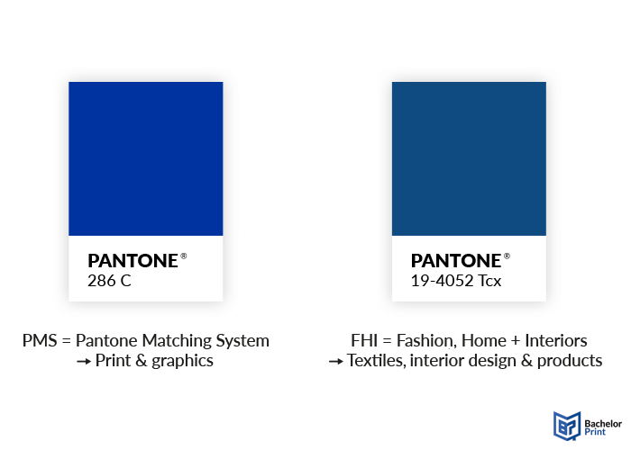
Pantone also uses a different coding system for its Fashion, Home + Interiors (FHI) range, but since these apply mainly to textiles and product design, we will not go into detail here.
The rise of Pantone
Pantone traces its origins back to the 1950s in New Jersey, where it began as M & J Levine Advertising, run by brothers Mervin and Jesse Levine. In 1956, they hired Lawrence Herbert, who used his chemistry background to organize the company’s pigment stocks and streamline ink production.
By 1962, the ink/printing side was profitable while the commercial-display division carried debt, so Herbert purchased the company’s technological assets for $50,000 and renamed the business “Pantone.”
Pantone introduced a standardized color system and “fan deck” guides, allowing designers and printers to match colors precisely, regardless of press, paper, or location. Adoption spread from graphic design into packaging, branding, textiles, and product design, establishing Pantone as the global standard for color consistency.
High-quality color copies from just $0.18
- Choose from different paper formats & paper weights
- Configure finishing options & add any extras you need
- Easy online ordering process with delivery to your doorstep
Learn more!
Pantone Matching System (PMS)
The Pantone Matching System (PMS) is the world’s best-known color system for achieving exact matches in print and design. It was created to solve one simple problem: ensuring that the same print color always looks the same, regardless of where or how it’s produced. These standardized references are often called PMS colors, and they are essential for reliable color matching in professional printing.
Core elements of the PMS
To make the Pantone Matching System work in practice, designers and printers rely on a few key tools:
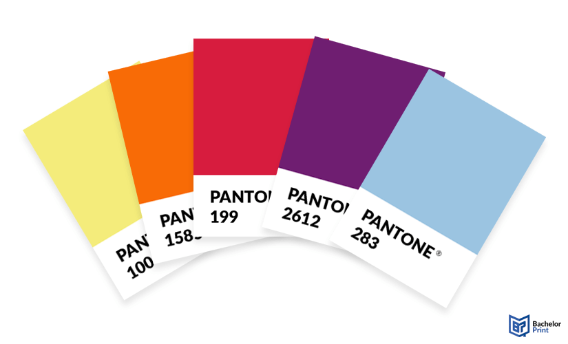
Pantone swatch books (fan decks)
= Pantone guides, which contain thousands of uniquely coded color swatches for universal reference.
Spot colors
= Pre‑mixed inks using Pantone’s proprietary formulas; offer unmatched consistency and vibrancy.
Process colors
= Created with the CMYK process; versatile but prone to variation depending on press and materials.
What do “C” and “U” mean?
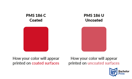
Pantone colors often come with a suffix like “C” or “U,” which indicates how the same ink formula looks on different paper types.
- C = Coated
➜ Color is printed on glossy paper. This finish makes colors appear sharper, brighter, and more saturated.
- U = Uncoated
➜ Color is printed on porous paper. Here, inks absorb more, making shades look softer and slightly darker.
The same Pantone number can look different depending on the paper stock, even though it’s the same ink formula. Designers and printers use these suffixes to communicate the exact appearance needed.
Why PMS works
What makes the Pantone Matching System so effective is the combination of proprietary ink formulations and standardized swatches.
Printers worldwide can reproduce the same shade by following Pantone’s guarded recipes, while designers specify exact tones simply by using color codes.
This shared system has turned Pantone into a global language of color, ensuring that a Coca-Cola red printed in New York looks identical in Tokyo or Berlin.
Pantone as a proprietary system
Pantone is a proprietary system. What Pantone owns is not the color itself but the tools and intellectual property that make the system work. This includes:
- The swatch books and fan decks that display colors
- The numbering system that uniquely identifies each shade
- The proprietary ink recipes that allow printers to reproduce them consistently
Because Pantone controls these elements, the system is protected by copyright and licensing. That means you cannot simply copy or reproduce Pantone colors freely; the guides, software, and libraries must be purchased and updated regularly. This business model is one reason Pantone remains both valuable and, at times, controversial in graphic design and professional printing.
➜ Pantone’s proprietary control ensures that its colors remain the global standard for consistency, but it also ties designers and printers into Pantone’s ecosystem of licensed products.
Why are they so expensive?
Pantone is often criticized for its high prices, and with good reason. The system is proprietary, meaning Pantone owns the swatch books, numbering system, and ink formulas. Access to these tools comes through licensing, unlike the CMYK process, which is free and universal.
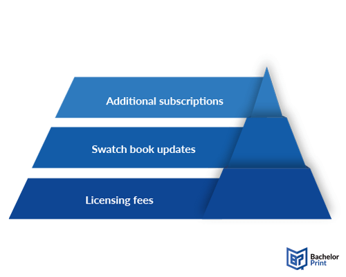
What drives the cost?
- Licensing fees
➜ Pantone controls its ecosystem and charges for access.
- Swatch book updates
➜ Guides fade and yellow over time, so professionals are encouraged to buy new editions regularly.
- Additional subscriptions
➜ After the Adobe–Pantone split, designers had to pay extra for Pantone access inside their design software, which especially affected those working with PMS colors on legacy projects.
Why do professionals still pay?
Despite the expense, Pantone delivers something unique: global consistency. For corporations or packaging producers, exact color reproduction is critical. In this sense, Pantone acts as insurance against mistakes.
Note: It is a costly system, but one that avoids even more costly branding errors.
And while freelancers or small studios may feel the burden of recurring costs, large companies rarely question the price tag. For them, Pantone is simply part of ensuring that their products look perfect, sell well, and maintain brand trust worldwide.
Pantone vs. CMYK vs. RGB
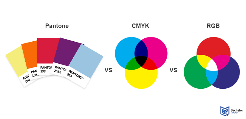
When talking about print colors, three systems dominate: Pantone, CMYK, and RGB. Each has its strengths but also clear limitations depending on whether you are designing for print or digital. In graphic design, knowing when to use Pantone spot colors versus the CMYK process or RGB is essential for getting the right results.
Pantone
Precise, pre-mixed spot colors are used for absolute consistency in branding and packaging.
CMYK
Subtractive model (cyan, magenta, yellow, black). Cost-effective and versatile, but less precise.
Additive model (red, green, and blue) for screens. Produces bright colors that rarely match in print.
Comparison at a glance
| System | How it works | Best for | Strenghts | Limitations |
|---|---|---|---|---|
| Pantone | Pre-mixed colors with unique codes |
|
Consistent color reproduction worldwide | Can be expensive with a limited color range |
| CMYK | Four inks mixed during printing |
|
Cost-effective and can reproduce many shades | Variations in print and less precision in branding |
| RGB | Digital colors created with light |
|
Bright, luminous colors, ideal for digital displays | Can't be matched in print, limited by screens |
Why is Pantone still the standard in branding?
For companies, brand recognition depends on absolute consistency. A Coca-Cola red or Starbucks green must look the same on every can, cup, or poster. CMYK may be cheaper, and RGB is perfect for screens, but Pantone remains the gold standard in branding because it guarantees that colors stay identical worldwide.
Consistent colors matter
In design and printing, consistency is everything. A brand’s identity often depends on a single color being instantly recognizable.
If those shades varied across packaging, ads, or merchandise, the brand’s impact would weaken. Pantone solves this problem by ensuring that a chosen shade looks identical everywhere, whether in offset, digital printing, or screen printing.
In fact, screen printing makes the need for accuracy even clearer. This method is often used for textiles, posters, and promotional products, and if the printing ink color shifts even slightly, the result can feel off-brand. That’s why companies rely on Pantone standards to guarantee that their logos and brand colors remain unmistakable, even in screen printing across different materials.
Ultimately, Pantone represents trust: designers and corporations continue to pay for it not because it’s cheap, but because it eliminates the risk of costly inconsistencies.
Color of the Year
Since 2000, Pantone has announced a Color of the Year. It is a shade selected to capture the cultural mood and creative direction of the moment. The choice is made by Pantone’s color experts, who study global trends in fashion, design, technology, art, and even politics. It is not just a printing decision but a statement about where design and society are heading.
The influence of the Color of the Year extends far beyond printing. It shapes fashion collections, interior design palettes, product packaging, and branding campaigns worldwide. For many companies, adopting the chosen shade is a way to stay relevant and aligned with contemporary aesthetics.
Last seven Pantone Colors of the Year
| Year | Color & code | Theme & impact |
|---|---|---|
| 2025 | Mocha Mousse 17 1230 |
A warm, grounding brown that conveys comfort and harmony |
| 2024 | Peach Fuzz 13-1023 |
Cozy, soft peach evoking gentleness and connection |
| 2023 |
Viva Magenta 18-1750 |
Bold crimson symbolizing optimism and fearless expression |
| 2022 | Very Peri 17-3938 |
A dynamic periwinkle blending modernity with optimism |
| 2021 | Illuminating 13-0647 Ultimate Gray 17-5104 |
Bright yellow paired with calm gray, symbolizing hope & resilience |
| 2020 | Classic Blue 19-4052 |
Trust, serenity, and timeless stability |
| 2019 | Living Coral 16-1546 |
Energetic, warm, and nurturing pink-orange tone |
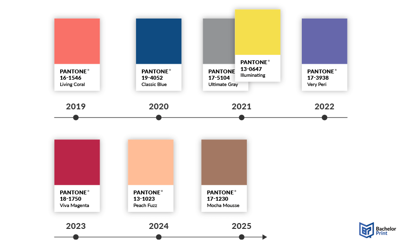
Each year’s pick resonates far beyond printing. They affect global aesthetic trends and consumer products.
Practical tips
Working with Pantone colors is straightforward once you know a few essentials. These tips help ensure that the color you choose makes it to the final product exactly as intended:

Always share Pantone codes
Give your printer the exact number, whether you’re working with PMS colors or conversions for CMYK. This eliminates guesswork and ensures both sides are speaking the same color “language.”
Know the difference between C and U
- Colors printed on coated, glossy paper appear brighter and more vibrant.
- Colors on uncoated, porous paper absorb more ink and look softer.
Specifying this detail prevents mismatched expectations.


Combine Pantone with CMYK when needed
In many print projects, CMYK is used for photos and detailed graphics, while Pantone spot colors highlight logos or key design elements. This hybrid approach balances cost-efficiency with precision, especially in screen printing, where one or two spot colors are often added to strengthen brand elements.
Never skip a proof
Even with Pantone standards, materials, finishes, and lighting can influence how a color looks. A printed proof is the safest way to confirm that the final result matches your expectations.

High-quality color copies from just $0.18
- Choose from different paper formats & paper weights
- Configure finishing options & add any extras you need
- Easy online ordering process with delivery to your doorstep
Learn more!
Conclusion
Pantone has grown from a simple ink catalog into the global language of color. By standardizing shades and ensuring consistency across media, it has become indispensable for branding, design, and even academic printing. Whether in offset, digital, or screen printing, Pantone guarantees that colors remain recognizable everywhere.
Despite criticism over its costs, professionals continue to rely on Pantone because it delivers what no other system can: trust and precision. Some experts in graphic design have suggested that a cheaper or open-access model might one day challenge Pantone, given how many people depend on color standards. Yet for now, such alternatives remain unlikely to replace Pantone in the near future.
That is why Pantone, with its unmatched consistency and global reach, will remain the benchmark of professional printing and branding for decades to come.
FAQs
Pantone colors are part of a standardized color system that ensures exact color reproduction worldwide through unique codes and swatches.
Pantone guarantees absolute consistency, making the same color look identical everywhere and earning the trust of designers and brands worldwide.
No, HEX and RGB are digital color models for screens, while Pantone is a proprietary spot-color system designed for precise printing.
Pantone does not own the colors as such but owns the swatch books, numbering system, and proprietary formulas that define and reproduce them.
Yes, Pantone controls its swatch books, numbering system, and ink recipes, which means access comes through licensed guides and tools.
Dissertation or thesis printing and binding
- Fast production & express delivery to meet your deadline
- Professional thesis & dissertation printing & binding services
- Premium materials, hard & soft bindings for a lasting impression
Learn more!