Saturation colour describes how intense, vivid, or muted a colour appears, and it plays a major role in how images and print colour are perceived. Highly saturated colors feel energetic, while low-saturation colors become calmer. This guide explains what saturation really means and how it behaves across media as well as how to control it effectively in both digital and physical workflows.
Saturation colour explained briefly
Saturation describes how intense or vivid a colour appears, with high saturation showing pure, strong colour and low saturation appearing more muted or gray. In printing, controlling saturation helps ensure colors look as intended and avoid washed-out or overly dull results.
Definition: Saturation colour
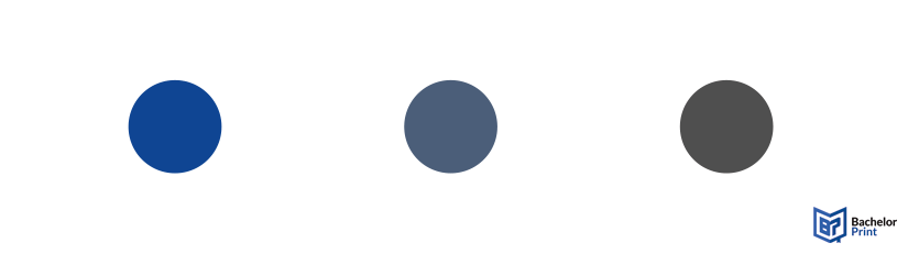
Saturation colour describes how vivid or muted a colour looks. Instead of imagining that gray is being added, it’s easier to think of saturation as how much hue is visible. A fully saturated colour shows its hue at full strength, while lowering saturation reduces the presence of that hue, making the colour look closer to a neutral tone.
High saturation
Colors are bright and intense as if they came straight from a paint tube. Nothing dilutes the hue, so it appears in its purest state.
Low saturation
Colors become muted or dull. As saturation decreases, the hue weakens and moves closer to the neutral axis of a colour model.
Achromatic
When saturation reaches zero, the colour loses hue entirely. What remains is a neutral value: either gray, white, or black.
➜ Saturation is one of the three fundamental components used to describe colour, alongside colour hue (the specific colour family) and value/lightness (how light or dark a colour appears). Together, these three attributes define how we perceive and reproduce colour in both digital and print environments.
Copy and print from A$0.16
- High-quality copies & prints for any project
- Vibrant colour prints or sharp black & white prints
- Online copy and print services delivered straight to your door
Learn more!
Saturation vs. hue vs. value
Since saturation colour is closely tied to a colour’s hue and value, it helps to look at all three side by side. Together, they describe what a colour is, how intense it appears, and how light or dark it feels.
Saturation
Hue
Value
What it describes
How vivid a colour appears
The “name” of the colour
How light/dark a colour is
How it behaves
Changes when you remove or strengthen the hue
Changes when you shift position on the colour wheel
Changes when you add white, black, or adjust brightness
Visual effect
Makes a colour vivid or muted
Defines the colour family
Controls depth and contrast
Example
Vivid red vs. dusty red
Blue vs. green vs. red
Light blue vs. dark blue
➜ Saturation tells you how strong the hue feels.
➜ Hue identifies which colour it is.
➜ Value determines how light or dark it appears.
Saturation vs. chroma
Although saturation colour and chroma are often used interchangeably in everyday language, they describe different things in colour science. Both measure how “colorful” something appears, but each uses a different reference point.
- Saturation evaluates a colour’s colorfulness relative to its own brightness.
- Chroma evaluates colorfulness relative to a reference white under the same lighting conditions.
This means a highly chromatic object can still appear low in saturation if it is very bright. This is why the terms blur together in everyday use: our eyes perceive them similarly, but colour models treat them differently.
Chroma
Saturation
Definition
Colorfulness relative to a white object under the same lighting conditions.
Evaluates a colour’s colorfulness relative to its own brightness.
Dependence on light
Perceived as relatively stable even when illumination changes (e.g., a red ball looks “red” in sun or shadow).
Changes with illumination; if brightness increases, saturation may decrease unless carefully adjusted.
Color space
Increases along vertical lines at the same lightness level in systems like Munsell.
Increases along lines radiating from the black point toward pure colour, keeping a constant ratio of colorfulness to brightness.
Application
Useful for consistent object-colour description in scientific and artistic systems (Munsell, CIELAB).
Common in digital workflows such as HSB/HSV, where increasing saturation often affects brightness too.
Because the distinction is subtle, many design resources simplify the topic and focus instead on the more intuitive trio of hue, value, and saturation.
In practical digital editing, another frequently used concept, vibrance, adds yet another term to the mix, which is why beginners often feel overwhelmed. The good news: for everyday photography, painting, and print preparation, you usually only need to understand saturation colour, not the deeper colorimetric definition of chroma.
Saturation vs. vibrance
Saturation colour and vibrance are often confused because both make colors appear more intense, but they work differently. Vibrance is a more selective, algorithm-based adjustment that boosts only the colors that need it.
Saturation
Vibrance
How it works
Boosts or reduces all hues equally
Targets low-saturation colors more
Effect on skin tones
Makes it look orange/artificial
Prevents unnatural colour shifts
Visual outcome
Strong, sometimes harsh colour intensity
More natural, controlled enhancement
Best used for
Why vibrance protects skin tones
Human skin contains a narrow range of sensitive hues. When global saturation increases, these hues intensify quickly and can shift toward orange or red. Vibrance algorithms detect these hues and apply gentler adjustments, keeping faces looking natural even when other colors receive a stronger boost.
Why designers use vibrance in mixed lighting
In situations where different areas of an image have different lighting temperatures or uneven colour intensity, vibrance prevents oversaturation by:
- Avoiding clipping in already vivid areas
- Boosting only dull or washed-out colors
- Maintaining realism across the entire composition
For designers preparing print or digital work, a good workflow is often: vibrance first for balance, saturation second for final intensity.
Saturation in print vs. digital colour
Saturation colour behaves very differently on a screen than it does on paper. The reason lies in the two opposite systems used to create colour: additive colour (RGB) for digital displays and subtractive colour (CMYK) for print.
Additive vs. subtractive behaviour
Digital colour (RGB)
Screens emit light. Colors become more saturated as more light is added, allowing extremely vivid hues, especially in the blues, greens, and neon ranges.
Print colour (CMYK)
Printers use pigments that absorb light. Every layer of ink reduces the amount of reflected light, which limits how saturated a printed colour can appear.
➜ Because of this, the RGB colour space is much larger than CMYK.
Why saturation drops when converting RGB to CMYK
When converting a design from RGB to CMYK, software must compress the colour gamut into a smaller space. This results in:
- Reduced saturation
- Flattened neon-like tones
- Less vibrant greens, blues, and purples
- Slight hue shifts in highly saturated areas
This isn’t an error; it’s a physical limitation of the printing ink.
Why neon or highly saturated colors are unprintable
Neon colors contain light wavelengths that pigments cannot replicate. A screen can display them because it emits pure light, but in print:
- CMYK inks cannot reflect enough light to achieve neon intensity
- Pigments can’t produce wavelengths outside their physical absorbance range
- Specialty inks (like spot colors) only approximate, not replicate, neon saturation
➜ This is why digital previews can be misleading if not viewed correctly.
Soft-proofing to preview saturation loss
Soft-proofing allows you to simulate printed output before sending a file to the printer. Software like Adobe Photoshop or InDesign can:
- Apply a CMYK colour profile
- Make targeted adjustments
- Identify out-of-gamut colors
- Preview how saturation drops
➜ This prevents surprises and ensures your final colour looks as close as possible to the original design.
High-quality colour copies from just A$0.28
- Choose from different paper formats & paper weights
- Configure finishing options & add any extras you need
- Easy online ordering process with delivery to your doorstep
Learn more!
Saturation & colour gamut limits
Saturation colour is always constrained by the gamut of the device or medium you’re working with. A colour gamut defines the full range of colors a screen, printer, or camera can reproduce. When a colour falls outside this range, software must translate it into something printable or displayable. This often reduces saturation.
Gamut clipping
When a highly saturated RGB colour cannot be reproduced in CMYK, the conversion process forces it into the closest printable value. This is called gamut clipping. The result can be:
- Visibly reduced saturation
- Lost detail in intense colors
- Hue shifts toward safer, more printable tones
Clipping affects neon greens, electric blues, and intense purples most dramatically.
Why different devices reproduce saturation differently
Every device has its own colour reproduction capability because of how it generates or reflects light:
-
Monitors
Use RGB LEDs with wide gamuts, allowing for extremely saturated colors. -
Printers
Use CMYK pigments that absorb light, limiting saturation and darkening colors as more ink is applied. -
Smartphones
Often display oversaturated colors by default to appear more vivid and appealing. -
Budget laptops
Typically show a narrow gamut (sRGB or less), making colors look duller than they actually are.
Thus a colour that looks perfectly saturated on one device may appear washed-out or overly intense on another.
ICC profiles & printer capability
ICC profiles help manage these differences by defining the colour gamut of a device or printer. They ensure that colors are translated as accurately as possible across media. Using ICC profiles allows you to:
- Get predictable print colour
- Keep hues consistent across devices
- Preview which colors will lose saturation
- Match output to the capabilities of a specific printer
High-end printers may support extended-gamut systems, allowing more saturated output, but even these systems cannot reproduce the full intensity of RGB light.
Usage
Saturation colour plays a powerful role in how an image or design is perceived.
High saturation = Energy, intensity, passion, excitement, or urgency
- These colors feel bold and alive, making them effective for calls-to-action or expressive photography.
Low saturation = Calm, subdued, somber, or nostalgic atmosphere
- Muted palettes often feel more sophisticated and can evoke introspection or quietness, especially in editorial design or fine art.
Saturation naturally directs the viewer’s eye. A highly saturated colour set against muted surroundings becomes an instant focal point. This is why designers often:
- Highlight key elements with stronger saturation
- Push background elements into softer, desaturated ranges
- Use saturation strategically to build depth and visual hierarchy
This is especially effective because high-saturation printing inks can make a selected area stand out without overwhelming the overall composition.
Altering saturation
Saturation can be adjusted in both physical and digital mediums.
Physical
In traditional media like painting or pigment mixing, saturation changes through the way colors are combined:
Mixing a colour with a gray of the same value is the most direct way to reduce saturation while keeping its lightness consistent. The hue weakens without becoming lighter or darker.
White (tint): Lightens the colour and often makes it feel slightly cooler
Black (shade): Darkens the colour and pushes it deeper or moodier
➜ Both reduce colorfulness because they dilute the purity of the hue.
Mixing a colour with its opposite on the colour wheel neutralizes the hue, creating a muted tone or even a gray. This is a classic way to soften high-saturation pigments while maintaining subtle harmony.
Digital
Digital tools offer precise, non-destructive ways to modify saturation:
Found in tools like Photoshop, Lightroom, Affinity Photo, or mobile editing apps. These sliders adjust saturation on a scale (often -100 to +100), increasing or decreasing the intensity of all hues at once.
Vibrance is a more refined algorithm that increases the saturation of dull colors while protecting already vivid tones. This avoids the harsh, unnatural effects that global saturation adjustments can produce and helps maintain a natural look in portraits and mixed-lighting scenes.
Both approaches allow designers to fine-tune saturation colour before exporting their work for digital display or print, ensuring consistent and intentional results.
Challenges
Working with saturation colour comes with several challenges.
❌ Oversaturation vs. undersaturation
Finding the right balance is subjective and depends on the message you want the image to convey.
- Oversaturation can make an image look artificial, harsh, or cause a loss of detail and banding in colors.
- Undersaturation can result in a dull, flat, or lifeless appearance.
❌ Color perception is relative
Saturation is not perceived in isolation. The surrounding colors dramatically influence how intense a hue appears. A moderately saturated colour can look vibrant if the background is muted or appear flat if the surrounding colors are extremely intense.
❌ Medium discrepancies
A colour that looks highly saturated on a bright RGB screen may appear noticeably weaker when printed. This happens because:
- Screens use additive colour (mixing light) ➜ Inherently more saturated
- Printers use subtractive colour (mixing pigments) ➜ Naturally less saturated
❌ Screen calibration
Different devices have different colour gamuts and brightness settings. Results:
- May look overly vivid on a smartphone
- Washed-out on an uncalibrated laptop
- A perfectly adjusted image on a designer’s monitor
❌ Protecting skin tones
Skin tones are especially prone to unnatural shifts when saturation increases globally. They can quickly become orange, red, or plasticky. This is why vibrance tools are often preferred.
Saturation exercises
Practical exercises are one of the best ways to deepen your understanding of saturation colour. By limiting the tools you work with or deliberately controlling how hue and value interact, you start to see how saturation affects depth, balance, and visual impact. These exercises help build an intuitive sense of how colors behave.
Working with a single hue or a set of muted colors forces you to rely on value rather than vibrancy to create form and depth. This teaches you how subtle shifts in saturation can still produce dimension and atmosphere, and how desaturated colors can carry a composition effectively.
Using only two complementary colors (such as blue and orange or red and green) reveals how powerful saturation contrast can be. When complementary hues touch, they appear more vibrant, and even small changes in their saturation dramatically shift tension, balance, and focal points within the artwork.
Creating a grid of tints, shades, and tones for several base colors helps you see exactly how adding white, black, or neutrals changes saturation. This approach develops a strong internal reference for how colors behave when mixed, making it easier to predict results in both physical media and digital adjustments.
FAQs
Saturation colour describes how vivid or muted a colour appears. High saturation looks bright and intense, while low saturation appears soft, grayish, or subdued.
A colour at 100% saturation shows its hue in the purest form, without any gray or neutral influence.
At 0% saturation, the hue disappears completely. The result is a neutral tone: white, black, or a shade of gray depending on the value.
Hue is the base colour family (such as red, blue, or yellow). Saturation describes how strong or weak that hue appears. A colour can have the same hue but different saturation levels.
