
You don’t need to understand mathematics to understand colour spaces. Although the concept may sound technical and quite complex at first, colour spaces play a very practical role in everyday design, printing, and digital media. This article explains what a colour space is in simple terms and shows why it matters, especially when colors are displayed on screens or reproduced in print.
Color space explained briefly
A colour space defines the range of colors a device or file can represent and reproduce. In printing and design, using the correct colour space (like CMYK for print vs. RGB for screens) helps ensure that colors remain consistent across devices and in the final print.
Definition: Color space
A colour space is quite an abstract concept at first, but its purpose is very practical. In simple terms, a colour space is a mathematical system that organizes colors so they can be represented, displayed, and reproduced consistently across different devices and media.
You can think of a colour space as a digital palette or coordinate system. Every colour is assigned a specific numerical value, which makes it possible to describe colors precisely instead of relying on subjective descriptions like “light blue” or “dark red.” This is especially important when working with print colour, where colors need to look as similar as possible on screen, in a PDF, and on the final printed page.
➜ The key idea is consistency. The colour shown in the swatch book and the colour produced by the printer are defined in a standardized way. Even though Pantone colors are not digital colour spaces in the strict technical sense, but part of a colour system, they illustrate the same principle.
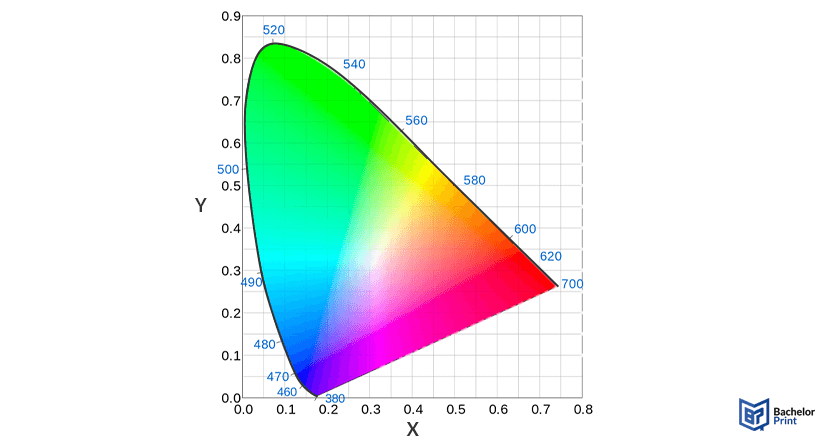
Why colour spaces matter in printing
Color spaces become important as soon as a design moves from the screen to paper. A document may look perfect on a monitor but appear different once it is printed. This is not a printing error, but a natural result of how colors are defined.
Screen colors vs. printed colors
Screens create colors using light, while printers reproduce colors using printing ink on paper. Because of this fundamental difference, not every colour that looks bright on a screen can be reproduced in print.
What colour spaces control
Color spaces define which colors are possible at all in a given system. If a file contains colors outside the printer’s capabilities, those colors must be adjusted automatically.
Typical results include:
- Visible colour shifts
- Reduced brightness or saturation
- Prints that appear duller than expected
Why the right colour space matters
Using an unsuitable colour space can directly affect the final print output. Choosing the correct colour space helps keep colors predictable and consistent from the digital file to the printed page.
PDF printing at BachelorPrint from A$0.16
- Upload your files & order printed PDFs in minutes
- Secure online PDF printing service with reliable delivery
- High-quality prints from any PDF, including reports & more
Learn more!
Color model vs. colour space
The terms “colour model” and “colour space” are often used interchangeably, but they describe different things:
Color model
A colour model is an abstract system for describing colors using numbers. A common example is RGB. Color models explain how colors are represented mathematically, but not how many colors can actually be shown or printed.
Color space
A colour space is a concrete implementation of a colour model. It defines a specific range of real-world colors, also known as the gamut. In other words, a colour space determines which colors from a model can actually be displayed or reproduced.
The gamut is the total range of colors a particular colour space can reproduce. A larger gamut means more available colors, while a smaller gamut limits how vivid or saturated colors can appear. If you’d like to know about colour gamut, our article about this topic is worth checking out.
Common colour spaces
Not every colour space is relevant for printing, but knowing the most common ones helps avoid unnecessary colour issues, especially when files move between screens, software, and printers.
Color space
Primary uses
Key characteristics
sRGB
Adobe RGB
Display P3
Rec. 709
Rec. 2020
ProPhoto RGB
OKLCH / OKLAB
RGB to CMYK
Most digital files are created in RGB because screens use light to display colors. RGB can produce very bright, glowing colors (e.g., neon colors).
Printing works differently. Printers use CMYK inks on paper, which means colors are created by absorbing and reflecting light rather than emitting it. This physical process has natural limitations: not every RGB colour can be accurately reproduced with ink.
When an RGB file is prepared for printing, the colors must be converted to CMYK. During this conversion, colors that autumn outside the printer’s range are mapped to the closest printable alternatives. As a result:
- Some colour hues may shift slightly
- Extremely bright colors may appear less vibrant
- Overall contrast can change depending on the paper and the ink
Which colour space should you use for printing?
There is no single “perfect” colour space for every print project. The best choice depends on the type of document and how important colour accuracy is for the final result. The following guidelines help keep things simple and predictable.
For photo-heavy documents or image-focused prints, Adobe RGB is often the better choice. It offers a wider colour range than sRGB, especially in green and cyan tones, which helps preserve more detail when photos are converted for print.
If a document contains logos or specific brand colors, consistency is key. In such cases:
- Avoid mixing multiple colour spaces in one file
- Use the colour space recommended in the brand guidelines
- Consider standardized colour systems if exact colour matching is required
For theses, dissertations, and other academic papers, sRGB is usually sufficient. These documents prioritize readability and consistency over highly saturated colors. Using sRGB ensures broad compatibility and minimizes unexpected colour shifts during printing.
Dissertation or thesis printing and binding
- Fast production & express delivery to meet your deadline
- Professional thesis & dissertation printing & binding services
- Premium materials, hard & soft bindings for a lasting impression
Learn more!
FAQs
A colour space is a standardized system that defines how colors are represented. It ensures that colors can be displayed and reproduced consistently across screens, software, and printed output.
There is no single best colour space. The right choice depends on the use case: sRGB for general documents, Adobe RGB for photo printing, and other colour spaces for specialized applications like video or advanced image editing.
RGB is a general colour model, while sRGB is a specific colour space based on that model. For most everyday use, especially documents and printing, sRGB is the safer choice because it offers high compatibility and predictable results.
Most traditional TV and broadcast content uses Rec. 709. Newer UHD and HDR content increasingly relies on wider colour spaces such as Rec. 2020.
