The colour is one of the most important elements in printed materials. Whether it’s a flyer, book, or business card. The way colors appear in print influences how we perceive quality and professionalism. But why do colors often look different when printed compared to what we see on screen? This article explains how print colour works, what technical factors play a role, and how to get the best colour results.
Definition: Print colour
Print colour brings colors to life on paper using ink or toner. Unlike digital screens that use light (RGB model), printing relies on the subtractive method. The pigments absorb light. The most common system is the CMYK model, which mixes cyan, magenta, yellow, and black inks to create various colors.
To keep colors consistent across different prints, printers also follow specific colour systems, like Pantone.
Note: “B” is already used for blue in the RGB system. “K” stands for key because black is the key colour that adds detail and contrast in printing. It helps line up (or “key”) the other colors.
⇨ So, K = Key = Black ink in printing!
Your guide to print and production
- Information on print finishing & print processing
- Information on materials & optimal use of materials
- Information on printing processes & print production
Learn more!
How it works
In printing, colors are created by mixing CMYK pigments. This is called subtractive colour mixing, meaning that the inks subtract light from the white background. For example, mixing cyan and yellow pigments results in green because both inks absorb certain wavelengths of light and reflect green.
A smooth colour gradient, a gradual blend between two colors, is achieved by carefully adjusting the printing ink distribution. Other important aspects include:
| Color hue | The basic colour type (red, blue, green, etc.). |
| Color tone | How light or dark a colour is. |
| Color space | The range of colors a device can reproduce. |
| Color depth | The number of possible colour shades in a print file. |
| Color gamut | The subset of colors that a specific printer or ink can display. |
| Saturation colour | How vivid or intense the colour appears. |
All these factors influence how colors will look when printed.
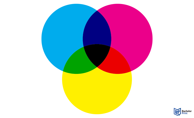
Note: In easy terms, subtractive colour mixing is how colors mix when you print with ink or paint. Imagine you’re layering colors on white paper. Each layer of ink blocks (subtracts) some light that hits the paper. The more ink you add, the less light reflects into your eyes.
Color theory basics for print
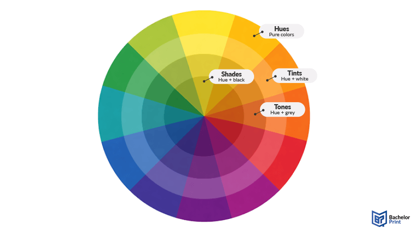
We’ve already introduced several key colour theory terms. The graphic below provides a clearer overview of these basics. Every colour starts with a hue (the pure colour), which can be modified by adding white (tints), black (shades), or gray (tones). These variations influence how light or dark a printed colour appears and how it is perceived on paper. In printing, these adjustments are created through different ink densities rather than light.
Color tools & profiles
Professional types of printers use ICC profiles to maintain colour accuracy in print. An ICC profile is a data set that describes how a device interprets colour information. It helps control the colour space so that colors appear consistently across different printers and screens.
Additionally, standardized colour systems like Pantone colors ensure that specific colors can be accurately reproduced, regardless of where or how the product is printed.
High-quality colour copies from just A$0.28
- Choose from different paper formats & paper weights
- Configure finishing options & add any extras you need
- Easy online ordering process with delivery to your doorstep
Learn more!
Digital vs. print colour
The key difference between digital and print colour lies in how colors are created:
- Digital services use additive colors (RGB) by mixing light.
- Print uses subtractive colors (CMYK) by layering pigments.
Because of this, some colors that look vibrant on screen may appear duller in print. This is due to differences in colour space, colour depth, and the limitations of pigment-based colour gamut.
Note: The CMYK colour system is called subtractive because the inks absorb, or take away, certain colors of light. When you put layers of cyan, magenta, and yellow (CMY) inks on white paper, each layer blocks some light from reflecting to your eyes. The more ink you add, the less light you see, so mixing all three CMY inks makes a dark colour—almost black. That’s why black ink (K) is added in printing: to get a deeper, true black that CMY alone can’t produce.
FAQs
Print colour refers to the reproduction of colors on paper using inks and the subtractive colour model (CMYK).
To print in colour, use a colour printer with CMYK inks and ensure your file is set to the correct colour mode.
Print colour uses the CMYK model. RGB is used for screens.
In your print settings, select “Color” instead of “Black & White” and ensure your file uses the CMYK colour mode.
You can check your file’s colour mode in your design software (e.g., Photoshop, Illustrator). Most printers automatically convert RGB to CMYK, but for accurate colour results, it’s better to convert your file to CMYK yourself and adjust colors before printing.
