Contrast is one of the most important printing terms in design, helping elements stand out by emphasizing differences in color, tone, size, or shape. It plays a key role in creating visual hierarchy, improving readability, and guiding the viewer’s attention across a page. In print media, where adjustments like screen brightness aren’t possible, strong contrast is essential to ensure clarity, structure, and lasting visual impact.
Contrast explained briefly
Contrast describes the difference between light and dark areas in a print. Higher contrast makes text and images easier to read and visually clearer.
Definition: Contrast
Contrast refers to the noticeable difference between elements in a composition, such as light and dark, large and small, or bold and subtle. This difference creates visual interest and helps guide perception.
The term comes from the Latin “contrastare,” meaning “to stand against,” which reflects how contrasting elements naturally draw attention by opposing each other.
In art and design, visual contrast adds depth and emphasis, making key parts of a layout stand out. In printing, contrast ensures that text is legible, colors are vibrant, and messages are communicated clearly. Whether in digital graphics or physical prints, design contrast is essential for clarity and impact.
High-quality color copies from just AU$0.28
- Choose from different paper formats & paper weights
- Configure finishing options & add any extras you need
- Easy online ordering process with delivery to your doorstep
Learn more!
Types
There are several types of visual contrast that play a crucial role in both digital and print design. Each type emphasizes different elements, such as color, tone, or layout, to enhance readability, structure, and visual appeal. Below, we explore the most important types of contrast in printing, along with practical examples.
Color contrast plays a vital role in how we perceive and engage with printed materials. It helps important elements stand out and ensures readability, especially in marketing materials, posters, and flyers.
What is it?
It’s the visual difference between two or more colors used side by side. Strong contrast improves clarity; weak contrast can make text difficult to read.
Common types of color contrast in printing include
Type
Description
Example
Light vs. dark colors
Contrast in brightness (not hue)
White text on a black background
Warm vs. cool tones
Warm colors pop against cool ones
Red title on a pale blue background
Opposite colors on the color wheel
Orange CTA button on a blue flyer
Tips for using in print
✅ Use dark text on light backgrounds for better readability
✅ Test your contrast in both natural and artificial light before printing
✅ Stick to brand colors, but adjust brightness or saturation to improve contrast
❌ Avoid low-contrast combinations like light gray on white or red on green
Tonal contrast refers to the difference between light and dark elements, regardless of color. It’s especially important in black-and-white or grayscale printing, where tone, not hue, defines depth and visibility.
What is it?
Tonal contrast is the variation in brightness (value) between elements. It determines how well shapes, text, or images stand out in a composition.
Common uses of tonal contrast in printing include
Use
Description
Example
Photography
Adds detail & mood with light/shadow
Dramatic portrait in a photo book
Tone for contrast
Tone replaces color to define contrast
Infographics printed in grayscale
Light vs. dark values
Strong contrast ensures clarity
Black logo on white letterhead
Tips for using in print
✅ Check your design in grayscale preview before printing
✅ Apply tonal layering to add depth in monochrome layouts
✅ Use pure black and pure white sparingly for the sharpest contrast
❌ Avoid using tones too close in value; they blend and reduce legibility
Layout contrast visually organizes content, guiding the reader’s eye and establishing clear hierarchy. With smart use of spacing, structure, and alignment, print designs appear clean and easy to navigate.
What is it?
It’s the visual difference between design elements created through their position, size, and spacing. This kind of contrast improves structure and emphasizes key content.
Key principles of layout contrast are
Type
Description
Example
Alignment
Contrast through grid & position
Centered heading, left-aligned text
White space
Empty space to balance content
Wide margins around text blocks
Visual hierarchy
Ordering elements by importance
Large title, smaller subtitle
Tips for using in print
✅ Add white space around key elements to let them “breathe”
✅ Align content deliberately, not everything needs to be centered
✅ Use different column widths or text boxes to highlight information
❌ Avoid overcrowding, clutter kills clarity
Typography contrast improves visual hierarchy and readability by varying font styles, weights, sizes, and spacing. In print, it guides the reader’s attention and makes layouts more dynamic and engaging.
What is it?
Typography contrast refers to the visual differences between type elements. It can be created through variations in font families, sizes, styles, and spacing.
Common types of typography contrast in printing include
Type
Description
Example
Weight, size, style
Emphasis through font variation
Bold title, smaller subheading
Serif vs. sans-serif
Mix of classic and modern fonts
Serif headline, sans-serif body
Spacing & letterforms
Improves readability with spacing
Generous line height in flyer text
Tips for using in print
✅ Adjust line spacing (leading) to prevent crowded text blocks
✅ Use bold or italic styles to highlight important info, like calls to action
✅ Pair contrasting fonts (e.g., serif + sans-serif) to create a clean hierarchy
❌ Avoid using too many fonts; stick to 2–3 max for a professional look
Why contrast matters in printing
In print design, contrast isn’t just aesthetic, it’s functional. It directly influences how well your message is perceived, understood, and remembered. While contrast is important in all forms of design, it plays a particularly critical role in printed materials, where visibility and clarity cannot rely on screen adjustments.
Legibility in print
Print doesn’t allow for brightness adjustments like screens do. What’s on paper is final. Strong contrast between text and background ensures that content remains readable under various lighting conditions. This is especially vital for:
- Business cards
- Flyers and brochures
- Instructional materials
- Certificates and official documents
Accessibility for all readers
Good contrast also makes print more inclusive. For users with visual impairments or color blindness, contrast can be the difference between understanding and confusion.
- Use high color contrast in text and graphics
- Don’t rely on color alone, but add patterns or icons to differentiate
- Tools like the WCAG contrast checker can also guide accessible print design
Screen vs. print contrast
Achieving effective contrast depends on thoughtful color selection, paper choice, and printing ink quality, not just settings.
Brand perception & user experience
High contrast gives printed materials a professional and polished appearance. It helps emphasize key messages, establish visual hierarchy, and express brand values clearly.
- A clean, legible business card shows professionalism.
- A well-contrasted flyer draws attention from a distance.
- A consistent use of contrast across materials strengthens brand identity.
Note: Contrast in printing enhances legibility, supports accessibility, and ensures your message makes a lasting impression, regardless of where or how it’s read.
How to create
Creating a strong contrast in printing is about more than just choosing colors. It’s a combination of smart typography, layout planning, and visual balance. Here’s a practical step-by-step guide to help you design print materials that are both striking and readable.
1️⃣ Choose contrasting fonts & sizes
Mix fonts with distinct styles and varying sizes to create hierarchy and guide the reader’s eye.
Do ✅
Don’t ❌
Pair a bold serif heading with a light sans-serif body
Use two fonts that are too similar
Use larger font sizes for titles
Keep all text the same size
2️⃣ Use high-contrast color combinations
Apply complementary or light–dark color pairs to highlight key elements and ensure readability.
Effective colors
Risky combinations
Tip: Use contrast checkers to confirm accessibility, especially for small text or fine details.
3️⃣ Control brightness & saturation
Avoid colors that are too similar in brightness. Even different color hues can blur together if their values are close.
✅ Boost brightness for lighter elements
✅ Use muted tones around bold accents
❌ Don’t use all saturated colors; it becomes overwhelming
4️⃣ Balance layout contrast without clutter
Combine white space, alignment, and structure to create clean visual contrast.
- Break content into clearly defined sections.
- Use ample margins and spacing around elements.
- Align consistently (e.g., headers left-aligned, body text justified).
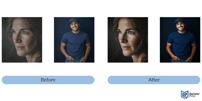
Before vs. after
Watch how contrast brings clarity and visual impact to an image.

Printing services at BachelorPrint
- Wide range of print products for every need
- Individual solutions & personal support
- High print quality & fast production times
Learn more!
Common mistakes
While contrast is essential for effective print design, it’s easy to go too far or not far enough. Below are the most common mistakes to avoid, along with tips on how to fix them for cleaner, more accessible designs.
❌ Too much contrast
Overdoing contrast can make a design feel unbalanced, noisy, or overwhelming.
Fix: Use contrast strategically. Highlight only what matters, and balance strong elements with calm, neutral areas.
❌ Too little contrast
Too little contrast can make your design look flat and hard to read, especially in print.
Fix: Ensure clear visual differences in tone, color, and size. Always test before printing because what seems fine on screen may disappear on paper.
❌ Relying on color alone
Using color as the only way to convey meaning excludes users with color vision deficiencies.
Fix: Combine color with other indicators, like icons, shapes, labels, or patterns.
❌ Poor contrast between background & text
This is one of the most common errors in brochures, posters, and business cards.
Fix: Stick to high-contrast color pairs and avoid combinations that strain the eye.
FAQs
Contrast refers to the visual difference between elements, such as light vs. dark, large vs. small, or bold vs. subtle, that makes one element stand out from another.
A simple example: black text on a white background. The sharp difference in tone ensures readability and visual clarity.
In art, contrast highlights differences in color, shape, tone, or texture to create visual interest, drama, or focus in a composition.
In printing, contrast improves legibility, hierarchy, and visual impact. It ensures your design communicates clearly, even without digital enhancements like screen brightness.
For print, it’s better to increase contrast to improve clarity. Brightness adjustments affect screens, but contrast directly affects how well printed text and images stand out.