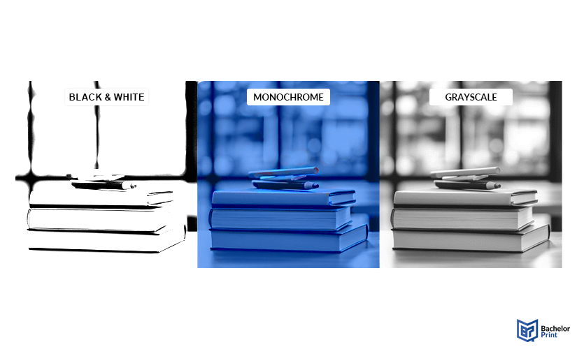
When exploring printing terms, one concept that frequently arises is grayscale. It’s a simple but important technique that focuses entirely on shades of gray. From academic papers to professional documents, grayscale plays a key role in print design. This article explains what it is, how it works, and when it’s the right choice. Understanding its benefits and limits helps you choose the best printing method for your projects.
Grayscale explained briefly
Grayscale refers to images composed of shades of gray between black and white, without any color. In printing, grayscale output uses varying tones of black ink to represent light and dark areas.
Definition: Grayscale
In simple terms, grayscale refers to an image that contains only shades of gray, ranging from pure black to pure white. There are no colors, simply varying levels of brightness.

Technical definition
A grayscale image is a single-channel image where each pixel stores one value: its brightness. In 8-bit images, this ranges from 0 (black) to 255 (white), allowing for 256 shades of gray.
Digital vs. print
In the digital world, grayscale is about intensity values. Each pixel has a brightness level that determines its shade. In printing, however, things work a bit differently. Printers can’t vary brightness directly; instead, they use a technique called halftoning, which is explained in more detail below.
⇨ So, while digital grayscale is based on pixel values, printed grayscale is an
optical illusion created through dot patterns.
Print black & white copies online for £0.08
- Print black & white copies in bulk or in small quantities
- Affordable single- & double-sided black and white copies
- Professional printing service for individual solutions or printouts
Learn more!
Grayscale in printing
Grayscale printing works differently from digital display. While a screen simply adjusts brightness levels per pixel, a printer must simulate these levels using only black ink or toner. To do this effectively, it relies on several mechanics and techniques.
Mechanics
- Uses only black ink or toner cartridges
- Suitable for text, diagrams, and black-and-white images
- Shades created by varying ink coverage (0 % = white, 100 % = black)
Techniques
To produce smooth and accurate gray tones, professional printers rely on a few key techniques:
Technique
Purpose
Halftoning
Simulates shades of gray using patterns of black dots
ICC Profiles
Controls how input values are translated in print
Tone Curves
Adjusts brightness and contrast across gray levels
Common printer settings
Some types of printers offer grayscale-specific settings:
- High contrast: Darker blacks and brighter whites
- High brightness: Lightens the overall appearance
- Normal grayscale: Balanced brightness and contrast
Note: These options are typically handled automatically in professional print services, but they affect how grayscale documents are rendered.
Grayscale vs. monochrome vs. black & white
These terms are often used interchangeably, but they refer to different image types, especially in printing.
Here’s a terminology breakdown
Grayscale
Multiple shades of gray between black and white
Monochrome
One single hue in varying intensity (e.g., sepia tones)
Black & white
Only pure black and pure white, no gray in between
Each format handles detail and tone differently, which can have a big impact on how your final print looks.
- Grayscale offers smooth transitions between tones, allowing for subtle shading and detailed contrast.
- Monochrome can feel more stylized or vintage, as it’s limited to one color family.
- Black & white images appear sharper and more graphic but can lose detail in midtones.
Grayscale strikes a balance between clarity and depth. This is ideal when color isn’t needed, but visual detail still matters.

How does it work?
Grayscale printing uses shades of gray, from black to white, to reproduce images and text without color. Unlike color printing, which combines cyan, magenta, yellow, and black (CMYK), grayscale relies solely on black ink or toner applied at varying intensities.
To achieve this, modern printers use a technique called halftoning: tiny dots of black printing ink arranged in different densities simulate lighter or darker shades. The closer together the dots, the darker the area appears; the more spaced out, the lighter the gray.

This process ensures:
- Clear contrast in text for excellent legibility
- Accurate tone rendering even in complex designs
- Smooth transitions in photos/graphics, especially in B&W images
It’s a practical approach for producing high-quality results without using coloured inks.
Applications
Grayscale printing is used across a wide range of fields, whether for cost savings, clarity, or creative effect. Here’s where it comes into play:
Used when printing needs to be practical and affordable.
Grayscale consumes significantly less ink than full-color CMYK, making it ideal for high-volume or low-budget print jobs.
Ideal for clean, formal presentations where color is unnecessary.
Grayscale improves readability and avoids distractions, especially in black-text-heavy files.
Applied in precision printing where tonal accuracy matters.
Industrial grayscale printing often uses halftoning and fine ink control to maintain detail and consistency.
A classic choice for artistic and expressive prints.
Grayscale allows for detailed tone reproduction in black-and-white imagery, especially with the right paper finish.
Affordable document printing from £0.08
- Crisp text, vibrant colors & multiple paper choices
- No need to visit a shop; simply order online anytime
- Print documents, copies & reports with professional quality
Learn more!
Benefits & limitations
Grayscale printing has clear advantages but it’s not perfect for every situation. Here’s a balanced overview:
Pros
- Uses only black toner or ink, which reduces print costs
- Consumes fewer resources, esp. when paired with recycled paper
- Offers high contrast and legibility, especially for text and diagrams
Cons
- Photos or visuals may lose subtle detail or appear flatter
- Not suitable for prints where color conveys critical meaning
- Without proper settings, grays can appear too warm/cool, or washed out
FAQs
Grayscale refers to images made up of varying shades of gray, from black to white, with no color.
- Grayscale includes many shades of gray.
- Monochrome uses one color family (often just black or another single hue).
Grayscale offers smoother tone variation, making it better for images. Pure black is ideal for crisp, high-contrast text.
In printing, grayscale means using only black ink or toner in varying densities to simulate shades of gray.
- Grayscale includes multiple gray tones.
- B&W contains only pure black and pure white (no gradients).