Color mixing is at the heart of every visual process. Whether you’re preparing artwork for digital printing, experimenting with pigments for printmaking techniques like screen printing, woodcut, or lithography, or simply trying to match a color across different paper types, the way colors interact determines how vibrant, dull, warm, or cool your final result appears. Understanding these interactions is essential for achieving consistent results across media.
Color mixing explained briefly
Color mixing describes how colors combine to form new ones, either additively with light (RGB) or subtractively with inks and pigments (CMYK). In printing, subtractive mixing of cyan, magenta, yellow, and black determines how final colors are reproduced on paper.
Definition: Color mixing
Color mixing refers to the process of combining two or more colors to create a new hue. How that new color appears depends on the mixing method and the medium you’re working with.
- In pigment-based environments such as painting, printing ink, or print color systems like CMYK, colors mix through subtractive mixing, meaning pigments absorb certain wavelengths of light.
- In digital environments such as screens, projectors, and LED displays, colors are mixed additively, where light is combined to create new colors.
- There is also average (optical) mixing, where small dots or strokes blend visually rather than physically. This is used in halftone printing, pointillism, and even some types of digital imaging.

Color theory basics
Color theory explains why certain mixes stay vibrant while others immediately turn muddy. Three core properties define every color:
- Hue (the actual color family)
- Saturation (intensity)
- Value (lightness or darkness)
Understanding these HSV components helps you predict how a mix will shift when you add another color, white, black, or gray.

Colors also have a warm or cool bias, even within the same hue.
This bias affects clarity: mixing colors with opposite biases often results in dull or neutral tones, while pairing similar biases produces cleaner, more vibrant results.

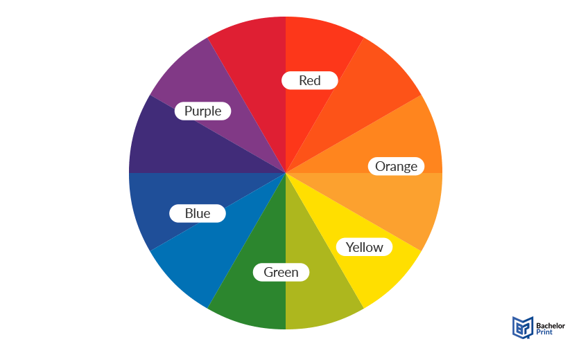
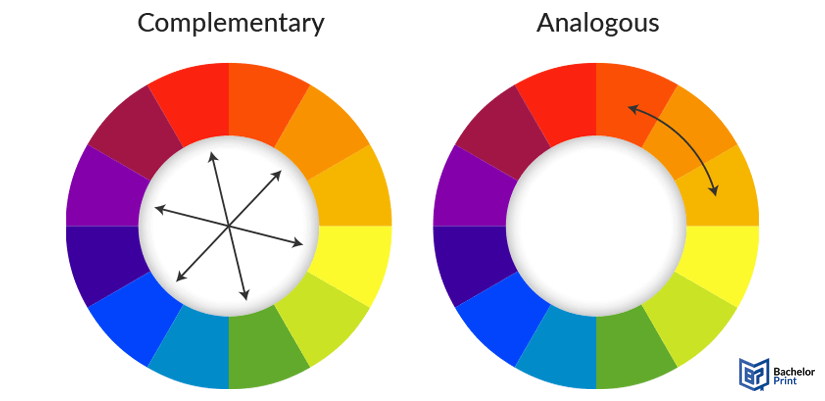
Complementary colors (opposites on the color wheel) are useful for adjusting saturation, creating natural-looking neutrals, or correcting mixes that feel too bright. Analogous colors (neighbors on the wheel) create smooth gradients and harmonious transitions, making them ideal for palettes that need visual unity.

➜ Mixes turn muddy when pigments with conflicting biases are combined or when too many pigments are added at once. Each additional pigment introduces more absorbed wavelengths, reducing reflected light and pushing the color toward brown or gray.
PDF printing at BachelorPrint from CAN$0.14
- Upload your files & order printed PDFs in minutes
- Secure online PDF printing service with reliable delivery
- High-quality prints from any PDF, including reports & more
Learn more!
Paints
Not all paints mix the same way. Their pigment load, drying time, and opacity determine how clean or muddy your mixtures will be. These are the most reliable paint types for controlled, predictable color mixing. Many artists rely on a limited set of primary colors, a principle known as the three-color rule, to achieve cleaner mixes and more harmonious color relationships.
Artist-grade acrylics
Best for:
✅ Fast, versatile studio work
Why they’re good for mixing:
- Quick drying, ideal for building layers
- High pigment load for vibrant, accurate mixes
- Available in opaque and transparent versions for better control
- Predictable behaviour when matching print color or CMY-based palettes
Oil paints
Best for:
✅ Smooth blends and subtle transitions
Why they’re good for mixing:
- Excellent for gradual gradients and controlled value shifts
- Very long drying time so colors stay workable for hours or days
- Strong pigment concentration keeps mixes rich rather than muddy
Watercolors
Best for:
✅ Transparent, luminous color palettes
Why they’re good for mixing:
- Easy to create smooth value changes
- Rely on transparency for clean, glowing results
- Great for studying pigment bias because muddy mixes are immediately visible
Gouache
Best for:
✅ Flat, matte, highly controlled color
Why they’re good for mixing:
- High opacity gives precise value control
- Rewettable so it’s easy to adjust mixes on the palette
- Smooth, consistent binder creates blends without unexpected shifts
Tools
The right tools make color mixing more accurate, consistent, and easier to repeat.
Palette knives vs. brushes
A quick comparison of how each tool affects your mixes:

Mixing palettes
Different palette materials affect how paints behave while mixing:
- Ceramic: Smooth surface; easy to clean; keeps mixes consistent.
- Plastic: Lightweight and budget-friendly; good for quick sessions.
- Glass: Ultra-smooth surface; ideal for scraping and achieving precise color matching.
Color reference tools
Color reference tools are essential for matching print color, choosing the right color space, or aligning hand-mixed paints with standardized systems:
-
Print color guides:
Help you understand how mixed colors will shift when converted to CMYK or other print systems. -
Digital color pickers:
Great for checking RGB and hex code values before preparing artwork for digital printing or color correction. -
Swatch booklets (like Pantone colors):
Useful for comparing your mix to industry-standard colors.
These tools help bridge the gap between physical paint and digital color models such as RGB, CMYK, HSL, or the Munsell color system.
Other tools
A few extra items can make mixing smoother and more predictable:
- Water containers for thinning, rinsing, and controlling pigment strength.
- Spray bottles to keep acrylics and gouache moist during longer mixing sessions.
- Mediums (retarders, glazing liquids, gel mediums) to extend drying time, increase transparency, or adjust the flow of your mixes.
Types
There are three main ways colors mix, and each behaves differently depending on whether you’re working with pigments, light, or printed images. Understanding these systems helps you predict how colors will shift.
Used in paints, dyes, printing inks, and any pigment-based medium. The colors form when pigments absorb certain wavelengths of light and reflect the rest.
Primaries:
- Cyan
- Magenta
- Yellow
➜ Foundation of CMYK printing
They’re used in plenty of fields:
- Painting
- Printmaking
- Inkjet printing
- Offset printing
- Screen printing
- Other processes that rely on physical pigments
Used in digital screens and projection. Colors form when different wavelengths of light are combined.
Primaries:
- Red
- Green
- Blue
➜ Mixing all three at full intensity produces white
They’re used across many types of displays:
- Phones
- Monitors
- Televisions
- Digital displays
- Any workflow involving RGB color spaces
The eye blends separate colors into one perceived color. There is no physical or digital blending because the brain averages what it sees. This happens through dots, strokes, or pixels placed close together.
They appear in many different visual techniques and printing processes:
- Dithering
- Pointillism
- Pixel graphics
- Halftone printing
- Any print technique where tiny colors merge visually
Mixing for print vs. paint
Mixing colors for paint and mixing colors for print may look similar at first, but they behave very differently.
Paints rely on RYB or CMY pigments, while printing uses the CMYK color model, which produces colors through extremely thin layers of ink rather than opaque strokes of pigment. Because of this, a color that mixes easily on a palette may not be achievable in print.
One key difference is color gamut. Paint pigments can produce certain saturated or highly specific hues that autumn outside the printable CMYK range. This means some paint colors simply cannot be reproduced exactly on a printer, even with high-quality inkjet printing or offset printing. The opposite is also true: CMYK can produce smooth gradients and halftone transitions that aren’t possible with thicker, textured pigments.
Digital files add another layer: RGB artworks often look brighter on screens because additive color expands the color space. When those RGB colors are converted to CMYK for printing, they can shift, dull, or lose vibrancy. This is normal because screens emit light, and prints reflect it.
Inks and pigments behave differently because of their materials. Printing ink is thin, transparent, and controlled through precise dot patterns, while paint pigments can be opaque, textured, or grainy. Their binders, opacity levels, and surface interactions produce different mixing results.
Practical advice
☐ Avoid relying on extremely bright RGB-only hues.
☐ Check your colors in CMYK before finalizing your design.
☐ Create a test print or compare your colors to print color guides.
☐ When in doubt, mix using CMY principles or reference a print color chart.
☐ Be prepared for slight shifts, especially with intense blues, greens, and neon colors.
Copy and print from CAN$0.14
- High-quality copies & prints for any project
- Vibrant color prints or sharp black & white prints
- Online copy and print services delivered straight to your door
Learn more!
Mistakes
Even experienced artists run into problems when mixing colors. These common mistakes can make colors look dull, muddy, or inconsistent:
Relying only on white, gray, or black
❌ Using white to lighten and black or gray to darken can flatten a color’s vibrancy. These adjustments reduce saturation, often resulting in dull, lifeless mixes.
Ignoring warm and cool bias
❌ Mixing pigments with opposing temperature biases can create unexpected shifts, making a color lean brown, green, or muted when you expect a clean secondary color.
Overmixing too many pigments
❌ Mixes quickly slip toward muddy neutrals. Most clean mixes rely on two pigments, so adding more than three almost always results in a dull color.
Using poor-quality paints
❌ Low-grade paints contain fillers that weaken the pigment load. These pigments struggle to produce saturated, predictable colors and muddy more easily.
Skipping swatches and tests
❌ Swatches make drying shifts, pigment strength, color cast, and potential color correction needs visible early on, so your final colors stay consistent.
Quick-reference table
Mistake
Why it’s a problem
Better approach
Using only white/grey/black
Reduces saturation → dull results
Adjust with complements when possible
Ignoring warm/cool bias
Unexpected color shifts
Match temperatures for clean mixes
Mixing too many pigments
Creates muddy neutrals
Use no more than 2–3 pigments
Low-quality paints
Weak pigment load = muddy mixes
Use artist-grade paints
No swatch testing
Drying shifts or print mismatches
Test small swatches first
Color charts
Color charts combine a basic color wheel with a structured mixing grid, giving you a visual map of how your paints behave. Instead of guessing how two pigments will interact, a chart shows the exact hue, value, and saturation you’ll get.
How to create a full mixing chart
A mixing chart is built by taking the paints in your palette (or a selected set) and mixing each one with every other color in equal ratios. Each row and column represent a different pigment. This creates a complete overview of all possible combinations from your palette.
Basic steps:
- Choose the paints you want to map.
- Draw a grid with the same colors across the top and left side.
- Mix each color with itself (pure swatch), then with every other color.
- Add optional rows for tints (with white), shades (with black), and tones (with gray or complements).
- Label pigments clearly to track which brands or series behave best.

Why color charts matter
Color charts help you see:
- How warm/cool bias affects secondaries
- How reliable a color is when layering or glazing
- Whether a pigment leans opaque or transparent
- Which pigments mix cleanly and which turn muddy
- How much saturation you lose or gain when mixing
Using charts for print color accuracy
Color charts are especially useful when preparing artwork for printing. They help you understand which of your mixed colors have close CMYK equivalents and which sit outside the printable color gamut. Referencing your chart alongside a print color guide or swatch book makes it easier to adjust your palette toward colors that will reproduce reliably in printing.
FAQs
Color mixing is the process of combining two or more colors to create a new hue. Depending on the medium, this happens through subtractive mixing (pigments and printing ink), additive mixing (light on screens), or average/optical mixing (dots or pixels blending visually).
The three-color rule means building an entire palette from just three primaries. Using a limited set, typically CMY or RYB, creates cleaner mixes and naturally harmonious color relationships.
Yes. Many online tools let you mix RGB or CMYK values, preview print color shifts, or simulate paint mixing.
- Study warm/cool bias
- Use color theory basics
- Test swatches regularly
- Create a full mixing chart
- Practice with a small set of primaries
This quickly builds confidence.
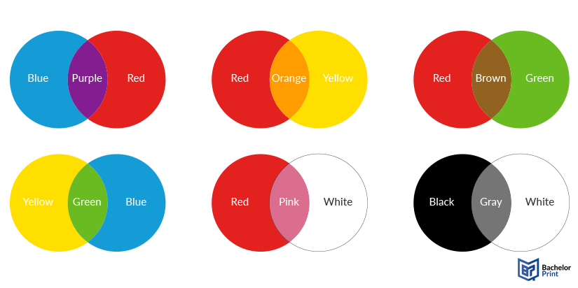
Common examples include:
- Red + Blue ➜ Purple
- Blue + Yellow ➜ Green
- Yellow + Red ➜ Orange
- Complement + Complement ➜ Neutral gray/brown
- CMY primaries ➜ The widest mixing range for print color accuracy
Dissertation or thesis printing and binding
- Fast production & express delivery to meet your deadline
- Professional thesis & dissertation printing & binding services
- Premium materials, hard & soft bindings for a lasting impression
Learn more!